Redesign case study

Background
We develop a system for fraud analysts to catch fraud in online payments using AI.
In the system, you write sophisticated rule logics to catch fraud.
You are also able to get statistics about your data and see details about
transactions and fraud.
When I started working in Fraugster, there was no product designer before me.
There were many design issues in the product, that not only made the product look
outdated and inconsistent, but also slowed down the development and prevented the
product from scaling.
Here is an example of how it looked like:

I talked with the head of product and told her about the problems in our product, and about the need for a redesign. That led to arranging a meeting with the stakeholders, which were the CEO and the CTO.

Meetings
I made a presentation, and explained them the problems, why we need a redesign and
what we want to get from those meetings:
After a few sessions with the founders, we confirmed that we need a redesign and
defined our goals:

UX side
At that time a UX designer joined our team, and right after finishing her onboarding, she dived into the redesign project, starting to do personas and user journey maps, and user flows.


UI side
First, I did indexing of all our components, grouped them and listed all our UI faults. Then I started researching the UI side, how our competitors look like, what style will fit us best, and


Sketching in grayscale

Finding the right color palette

Testing design on a real page

The "mass-production"
After we got the green light on the new style, we could start the massive work. While the UX designer was working on the wireframes, I started building a design system and later moved to creating the UI mockups

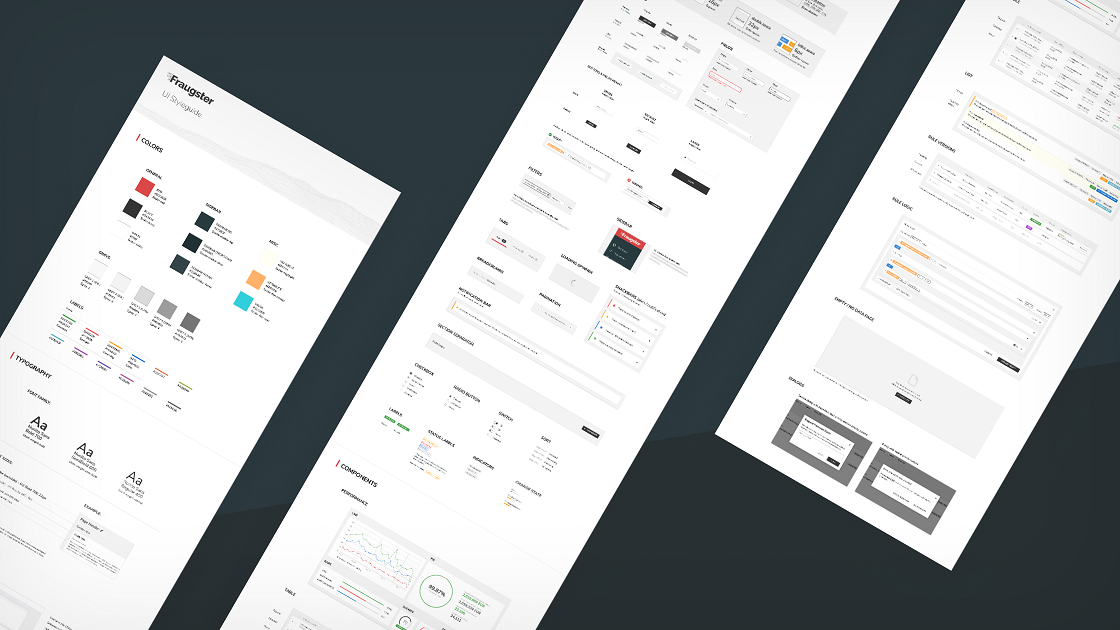
UI Styleguide
A complete styleguide including all our components, elements, sizes and colors to guide our current and future developers and designers in the product team for consistent UI.

When the development started, we moved to physical standups (instead of slack) and printed a huge poster of all the pages to keep track of it and used sticky notes on it whenever its done or blocked.

In the code, we used only the colors of the styleguide. And instead of using them as hex we used them as vars, In case we decide to change them in the future, we can change them in one place and it will change everywhere.


Problems & solutions


Transactions


When the redesign project was over, I made a presentation about it and finished it with "First we made it work, now we'll make it cool!". The goal of the redesign project was to prepare a base for scaling, faster development and consistency. After accomplishing that, we could start developing the product properly.

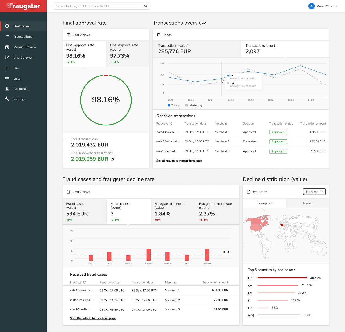
Looking forward a year after the redesign. We managed to develop more than 10 new sections in our platform, including a new dashboard, new transaction page and a rule manager. All built to give the users the right tools to manage risk and catch fraud. Here are some examples of the new pages that we developed:


